
Team colour selection is arguably the most permanent and impactful decision a sports club, school, or corporate team will ever make during its branding journey. Long before a player makes their first move on the field or a fan cheers from the sidelines, the colours of the uniform communicate a message about the team’s spirit, ambition, and history. In the competitive Australian sporting landscape, where every club strives to stand out, your chosen palette is the primary visual anchor of your team identity. It is the banner under which your community rallies and the first thing your opponents see when you step onto the pitch.
At Team Spirit Sports, we have spent decades helping Australian teams bring their visions to life through world-class custom apparel. We understand that a team colour isn't just a swatch in a catalogue; it is a psychological tool that can influence performance and unity. In this comprehensive guide, we will explore the deep science behind colour selection, how to create high-impact combinations, and why your choice of kit technology matters as much as the shades you select.
The Psychology of Team Colour: What Your Kit Says to the World
Colors are not just visual stimuli; they trigger specific emotional and physiological responses. When choosing a team colour, you are essentially choosing the "mood" of your organization. Let’s break down the psychological impact of the most popular choices in the sporting world.
Read more: The Psychology of Colours in Sports Design: How Colours Influence Performance
Red: The Energy of Aggression and Speed
Red is scientifically proven to increase the heart rate and evoke a sense of urgency and power. In sports, red is often associated with dominance and high-intensity performance.
- Psychological Impact: It triggers the "fight or flight" response, making players feel more aggressive and opponents feel more intimidated.
- Best for: Rugby, Soccer, and Boxing where high energy is required.
Blue: The Symbol of Trust and Precision
Blue is the most popular colour in the world for a reason. It represents stability, loyalty, and calm under pressure.
- Psychological Impact: It helps athletes stay focused and lowers perceived stress levels. It communicates a sense of "professionalism" and "discipline."
- Best for: Swimming, Basketball, and Corporate team-building events.
Gold and Yellow: The Pursuit of Excellence
In the Australian context, gold is synonymous with national pride and victory.
- Psychological Impact: Yellow and gold are associated with optimism, happiness, and high energy. It is a highly visible colour that commands attention.
- Best for: National representative teams and clubs aiming to reflect a "premium" status.
Green: Harmony and Endurance
Green is the colour of growth and balance. It is often used by teams that want to emphasize their connection to the community or the natural environment.
- Psychological Impact: It has a soothing effect and is associated with endurance and persistence.
- Best for: Cricket, Field Hockey, and Golf.
Black: Authority and Intimidation
Black is the ultimate power colour. As seen with the New Zealand All Blacks, this team colour choice creates a formidable presence.
- Psychological Impact: It represents sophistication, authority, and mystery. It is also psychologically slimming, making athletes appear more streamlined and agile.
- Best for: Elite competitive squads and contact sports.
Strategic Factors When Selecting Your Team Colour Palette
Choosing a team colour is more than just picking your favorite shade. You must consider several strategic factors to ensure the longevity and functionality of your brand.
1. Visibility and Field Contrast
Your kit must be visible to both your teammates and the spectators. If you play on a lush green field, a predominantly dark green team colour might make it difficult for a quarterback or a playmaker to spot a teammate in their peripheral vision.
- Tip: Choose a primary colour that contrasts with the playing surface. For example, basketball uniforms often use vibrant shades because the hardwood courts are relatively neutral.
2. Climate and Fabric Heat Absorption
Australia is known for its intense sun. If your team plays in the peak of summer, choosing black or navy as your primary team colour could lead to heat exhaustion more quickly. Darker colours absorb more UV radiation and heat.
- TSS Insight: We recommend lighter palettes or high-performance moisture-wicking fabrics for summer sports like cricket to keep players cool.
Read more: What Is the Most Breathable Fabric?
3. Rivalry and Existing Club Identities
In any local association, you don't want to look exactly like your biggest rival. Research the other clubs in your league. If three other teams already use Blue and White, choosing those as your team colour will make your brand forgettable.
- Strategy: Look for a unique secondary or accent colour to differentiate your club.
4. Branding and Sponsorship Compatibility
Most clubs rely on sponsors. When choosing your team colour, consider how common sponsor logos will look on your jersey. A neon pink jersey might clash with the red and green logo of a local sponsor, making it harder to secure funding.
Read more: Logo Placement Guide for Custom Sportswear: Tips for Maximum Brand Visibility
The Science of Colour Combinations: Creating a Winning Palette
Rarely does a team use only one colour. Most successful brands use a 3-colour system: Primary, Secondary, and Accent.
Read more: 10+ Best T-Shirt and Ink Colour Combinations for Custom Sportswear in Australia
Source: Shutterstock
The 60-30-10 Rule in Sports Design
- 60% Primary Colour: This is the base of your jersey and shorts.
- 30% Secondary Colour: This is used for side panels, sleeves, or large patterns.
- 10% Accent Colour: This is reserved for the trim, team slogan, or numbers.
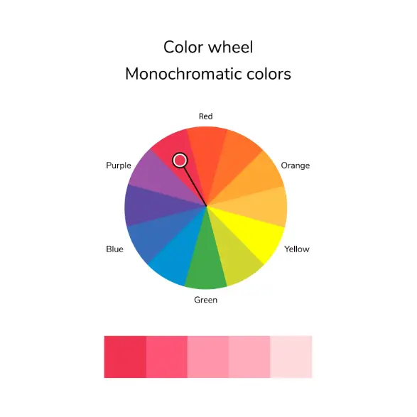
Complementary vs. Analogous Schemes
- Complementary Colours: These are opposite each other on the colour wheel (e.g., Blue and Orange, Purple and Gold). They provide the highest contrast and are the most visually striking.
- Analogous Colours: These are next to each other (e.g., Navy and Royal Blue). They create a more harmonious, subtle look but require a strong accent colour (like White) to ensure the numbers are readable.
The Importance of High-Contrast Numbers
The most common mistake in team colour selection is choosing a number colour that doesn't contrast enough with the jersey. If you have a dark green jersey, do not use navy numbers.
- Standard: White or Yellow numbers on dark jerseys; Black or Navy numbers on light jerseys. This ensures umpires and fans can identify players instantly.
Sport-Specific Considerations for Team Colour
Different sports have different traditions and functional requirements that should influence your team colour choice.
Rugby: The Need for Grit
Rugby is a game of mud and contact. White jerseys look amazing for the first five minutes but quickly become stained. Many rugby clubs opt for darker primary colours or busy patterns that hide grass and dirt stains better than solid light colours.
Cricket: The Tradition of Whites
While "whites" are the tradition, the rise of T20 cricket has seen an explosion of team colour creativity. Australian clubs are increasingly using indigenous-inspired designs and vibrant palettes to attract younger audiences.
Netball: Visibility on the Court
Netball is a fast-paced game with lots of movement. High-visibility team colour choices help midcourt players make split-second decisions during a centre pass. Read more about inspiring your squad in our guide to netball quotes.
Swimming: Safety and Style
In the water, certain colours are more visible for safety. For custom swimwear, bright neons and strong primary blues are both functional and fashionable.
Technical Excellence: How Sublimation Protects Your Team Colour
You can choose the most beautiful shade of "Sky Blue" in the world, but if it fades to a dull grey after three washes, your brand is damaged. This is where the manufacturing process becomes vital.
Why Sublimation is Superior for Colour Integrity
At Team Spirit Sports, we use Sublimation Printing for almost all our custom gear.
- Permanent Bond: The ink is gassed directly into the polyester fibres. This means your team colour will never crack, peel, or fade, even in the harsh Australian sun or chlorinated pools.
- Pantone Matching: We use the Pantone Matching System (PMS) to ensure your club's red is exactly the same every time you reorder. Consistency is the key to a professional brand.
- Zero Texture: Since the dye is in the fabric, the colours don't add weight or block the breathability of the garment.
Explore the difference quality makes on our homepage.
Step-by-Step Guide: How to Choose Your New Team Colour
If you are starting a new club or rebranding an old one, follow this professional workflow to ensure you get it right the first time.
Step 1: Research and Moodboarding
Start by looking at the best-looking teams in the world, not just in your sport, but in others. Create a "Moodboard" of images that reflect the "feeling" you want your club to have. Are you "Traditional and Prestigious" or "Fast and Modern"?
Step 2: Survey Your Community
Team colour is a sensitive topic. If you are changing a 50-year-old colour scheme, you must involve the members. Send out a survey with 3-4 professional mock-ups and let the community vote. This creates buy-in and ensures everyone feels part of the new team identity.
Step 3: Check Your Equipment Compatibility
If your club already owns thousands of dollars worth of equipment (bags, goal post pads, gazebos) in a specific colour, your new team colour should ideally complement those existing assets to save on costs.
Step 4: Get a Physical Sample
Screen colours are deceptive. A "Navy" on an iPhone screen looks different than on a MacBook or in person. At TSS, we can provide fabric swatches so you can see how your team colour looks in natural Australian sunlight before you commit to a full order. Contact us to request a sample pack.
Step 5: Finalise Your Brand Guidelines
Once you’ve chosen your palette, document it. List the exact Pantone codes for your Primary, Secondary, and Accent colours. This ensures that your social media graphics, your website, and your uniforms always match perfectly.
Modern Trends in Team Colour Design for 2026
The world of sports fashion is constantly evolving. Here are the trends we are seeing in our Australian factory right now.
Read more: Top Sportswear Trends: Custom Teamwear & Activewear in Australia
1. Retro-Modern Reboots
Many clubs are returning to their original 1970s or 80s team colour palettes but with modern, geometric designs. It’s a way to honour history while looking toward the future.
2. Earthy and Indigenous Palettes
There is a beautiful movement toward using ochre, deep greens, and sandy yellows to reflect the Australian landscape and acknowledge indigenous heritage. These team colour choices create a deeply meaningful connection to the land.
3. Gradient and Ombre Effects
Thanks to sublimation technology, we can now blend one team colour into another. A jersey that fades from Navy at the bottom to Cyan at the shoulders is a modern, dynamic look that was impossible with old screen-printing methods.
4. Neon Accents on Dark Bases
A "Stealth" look, predominantly black or charcoal, with a single neon "Electric Lime" or "Hot Pink" accent is incredibly popular for social T20 cricket and basketball teams.
Sustaining Your Brand: Consistency is Everything
The most successful sports brands in the world, the Lakers, the Wallabies, and the Ferrari F1 team, never change their core team colour. They understand that repetition leads to recognition.
Avoiding the "Trend Trap"
It can be tempting to choose a team colour because it is "on trend" this year (like Mint Green or Lavender). However, will that colour still look good in 10 years? For long-term club success, stick to classic palettes and use trends only for limited-edition "clash" jerseys or training gear.
Maintaining Colour Across Multiple Items
Your team colour should be consistent across all your touchpoints:
- Match Jerseys and Shorts
- Training Tees and Singlets
- Club Polos and Hoodies
- Softshell Jackets and Tracksuits
- Custom Socks and Caps
At Team Spirit Sports, we specialise in "Club Packages" where we ensure your specific team colour is perfectly matched across all these different fabrics and items.
Conclusion: Lead with Colour, Win with Spirit
Your team colour is the first chapter of your club's story. It is a visual promise to your players, your fans, and your community. By understanding the psychology of colour, the science of contrast, and the technical requirements of high-performance printing, you can create a brand that inspires pride and commands respect.
Don't leave your team’s identity to chance. Choose a palette that reflects your values and wear it with confidence. At Team Spirit Sports, we are proud to be the hands that build the uniforms for the next generation of Australian champions.
Are you ready to see your new team colour on a professional mock-up?
Get in touch with our design experts today: https://www.teamspiritsports.com.au/contact-team-spirit-sports
Visit our homepage to explore our custom sports apparel: https://www.teamspiritsports.com.au/
Frequently Asked Questions (FAQ) About Team Colour
To help you finalize your decision, we’ve answered the most common questions regarding team colour and custom manufacturing.
1. Can we have more than three colours in our palette?
Technically, yes. With sublimation, you can have an unlimited number of colours. However, from a branding perspective, we recommend sticking to 2-3 main colours. Too many team colour choices can make a jersey look cluttered and unprofessional.
2. How do we ensure our team colour matches our existing logo?
When you contact us, send us your logo in a high-resolution vector format (AI or EPS). Our designers will use a Pantone eye-dropper tool to match the jersey colours exactly to your logo’s specifications.
3. What is a "Clash Jersey" and do we need one?
A clash jersey is a secondary uniform in a different team colour used when you play an opponent with a similar palette. For example, if your primary colour is Navy, your clash jersey should be White or Yellow. Most competitive leagues require a clash option.
4. Do neon colours fade faster in the sun?
Neon dyes are chemically different than standard dyes. While sublimation is highly resistant to fading, neon team colour choices may see very slight fading over several years of intense UV exposure compared to standard colours. However, our Italian-ink sublimation is the most durable option on the market.
5. Can we use metallic colours like Silver or Chrome?
True metallic "shining" colours cannot be achieved through standard sublimation (which is matte/satin). However, we can use "gradient shading" to create a visual effect that looks like metallic silver or gold from a distance.
6. How does team colour affect friendships and bonding?
Wearing the same team colour triggers a psychological sense of "tribalism" and belonging. It reminds players that they are part of a shared mission.